Hospitality Full Branding, Logo Design, Advertising, Signage, and More


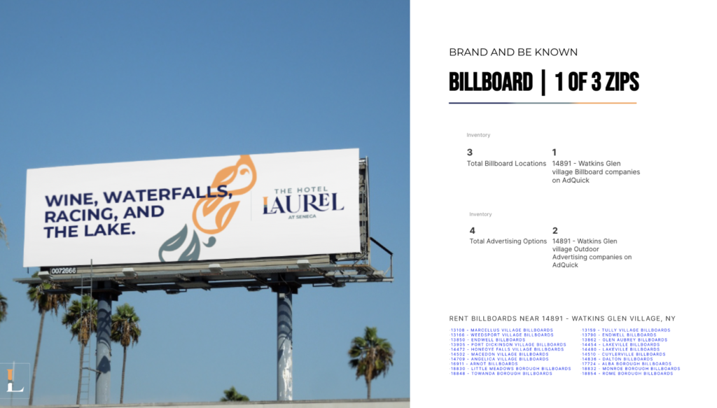
Imagine that you get off the plane and you’re ready to start tasting regional wines in the mountainous lands of New York overlooking the wondrous blue lakes. Or perhaps you’re going to explore breathtaking waterfalls the day before you experience one of the exhilarating international Sports car racing.
One might anticipate you’ll want to stay in a hotel that offers as much personality as the surrounding adventures. That’s exactly what we were thinking when a previous client of ours came back requesting we do what we did before but now with something that had a much more grand vision of scaling.
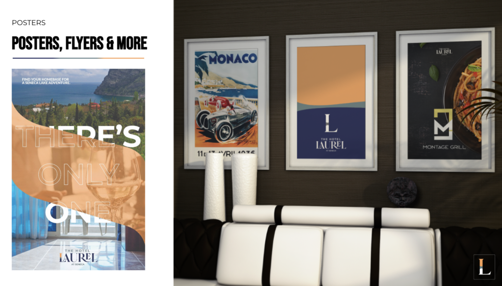
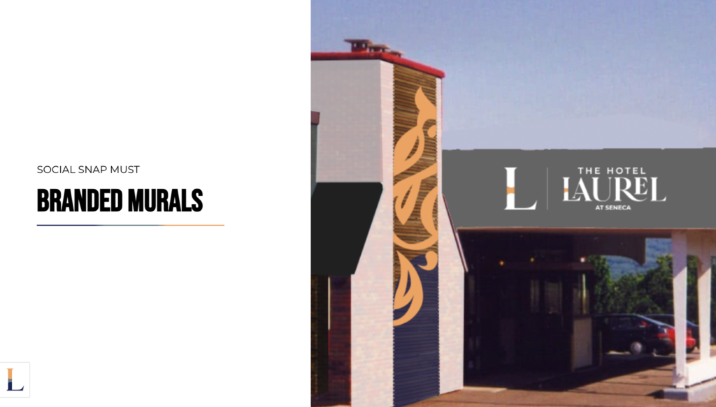
We were also up against a heritage hotel where history roamed the walls and streets. With our Creative Director being a big gear head (gear head: car guy) and with the hotel previously named “Glen Motor Inn” he made sure to show respect in the rebrand.
The new owners of the hotel wanted something that was mid-century modern + elegant + had a prestigious name. Working with Trademark attorneys, the owners and our team, we arrived on “The Hotel Laurel” with “At Seneca” added to the end. As the brand scales, the “At” will be changed based on the location a new hotel is opened.
The logo mark “L” is a blend of class with mid-century modern color/shape artistry as so described by our Creative Director.
This is only the beginning of this brand for us. So stay tuned as we reveal how this brand truly comes to life with the refurbishment of the hotel itself.

