Multi-location Physical Therapy Rebrand & Marketing in Jacksonville, FL


As a healthcare practice switches hands from one owner to the subsequent following impressive growth over several decades, it then becomes a legacy brand. One important thing every business must do is to show growth in the way the company operates but also in how it is seen.
We take rebrands seriously, and although you can get a logo mark at the discount aisle of your local Big Lots, logos aren’t all created equally.
Where is a good place to start when rebranding a business? As our client likes to say, “start with the end in mind,” so that’s exactly what we did. We go into our development meetings with the intent to understand the exit strategy along with the plans to scale. This allows us the opportunity to plan a design that lasts a long time but also leads our clients into the next phases of their business model.
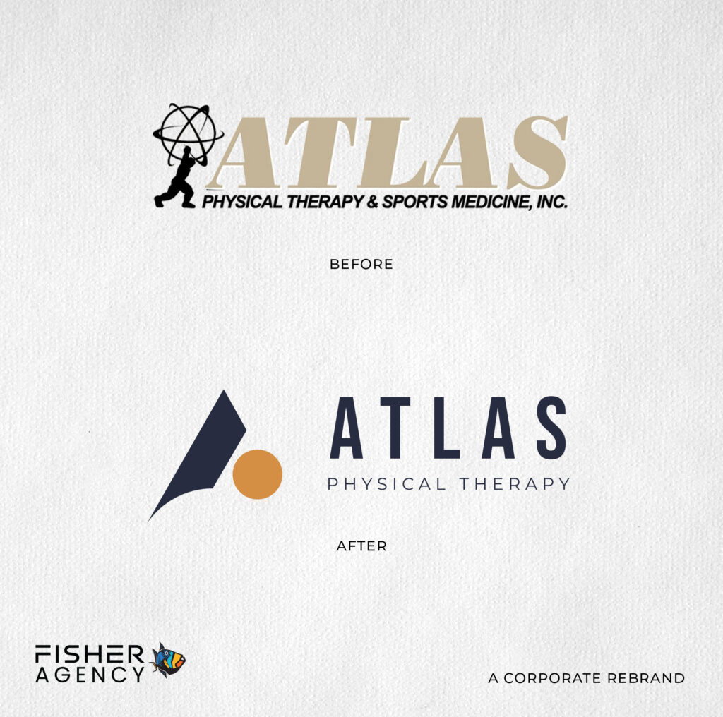
With Atlas, we took a very old style and retired it. Working to get away from the origins of Atlas and more into the unrelenting motivation of the owners, we gave the name new meaning and purpose.
We created a sporty style with sharp lines, and a forward angle but also left room for some softness as they are a physical therapy clinic combined with sports medicine.
The challenge was creating such a clean modern style that could run the risk of being replicated by imitators but stood strong when challenged. Atlas is a community-focused business here in Jacksonville and in surrounding areas with the mentality to always stand strong, empowering its patients and clients at the same time.
What you’ll see here is a breakdown of the logo as a “lock up” (full logo with description/tagline), the comparison from old to new, the icon itself, and then the icon applied to apparel.

