

Grid Layout: Container Properties, Dimensions, Responsiveness, Track Sizing, Item Placement, Browser Support, Limitations, Named Areas, Spacing, Explicit and Implicit Tracks

A grid layout is a CSS system that arranges web page content into rows and columns for two-dimensional placement. Key aspects include dimensions, container properties, track sizing, responsiveness, browser support, item placement, named areas, limitations, explicit and implicit tracks, and spacing. You define a grid on a container element, and its direct children are placed into the cells and areas that the rows and columns create. Track sizing uses fixed lengths, fractions, and content-based values, so you control how space is divided along each axis. Grid has been supported by all major browsers since 2017, and container properties such as gap, template areas, and alignment shape the overall structure. Responsiveness comes from functions like minmax and auto-fit, which let columns adjust to the available width, a technique that local web design companies near me Tampa FL often use in page structure work. Within website design, the layout model replaces many older float and table methods for building page frames.
Key Takeaways
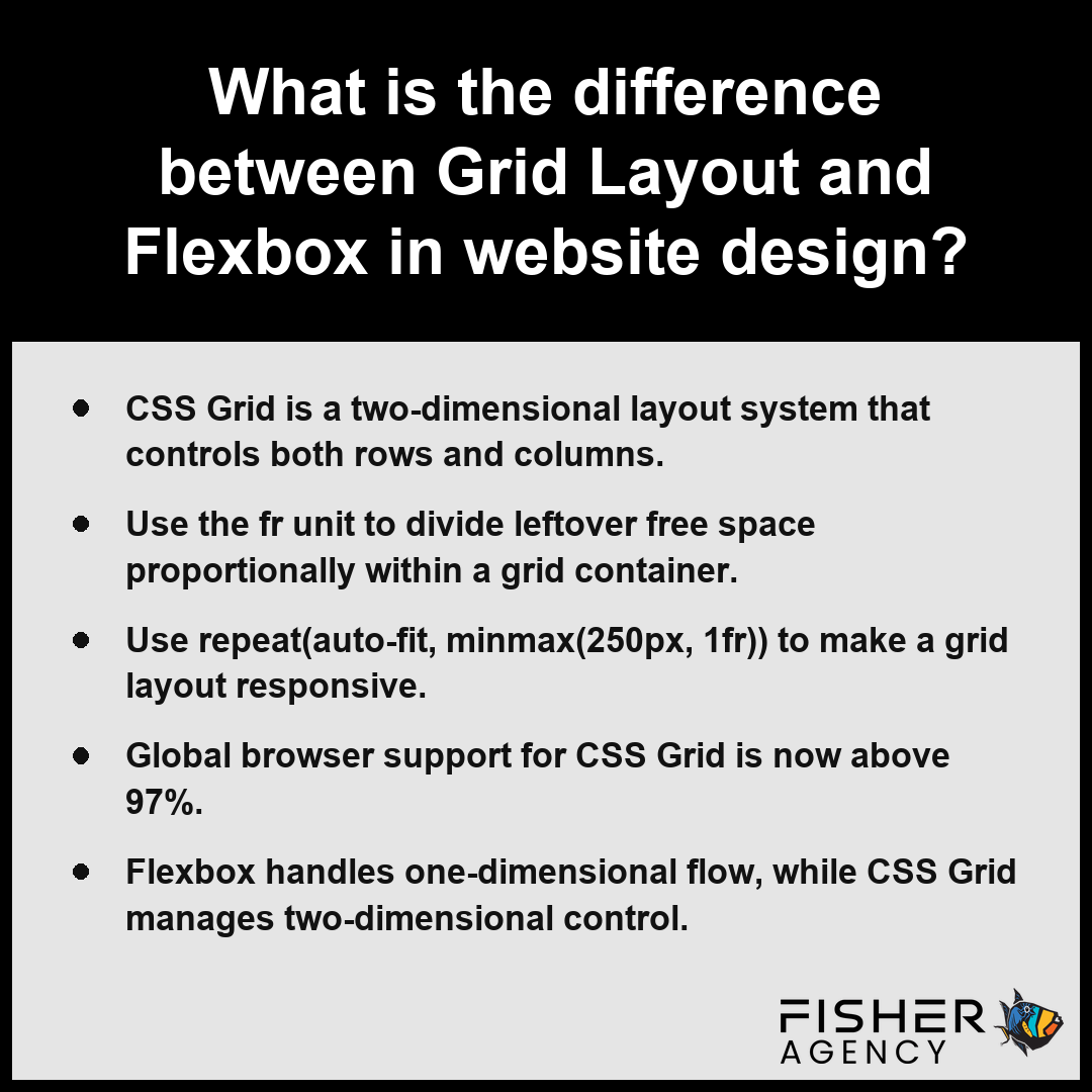
- CSS Grid is a two-dimensional layout system that controls both rows and columns.
- Use the fr unit to divide leftover free space proportionally within a grid container.
- Use repeat(auto-fit, minmax(250px, 1fr)) to make a grid layout responsive.
- Global browser support for CSS Grid is now above 97%.
- Flexbox handles one-dimensional flow, while CSS Grid manages two-dimensional control.
Which Container Properties Do You Need to Set Up a Grid Layout?
The container properties you need to set up a grid layout include specific declarations that activate the environment and define the track structure for your grid items. Per the World Wide Web Consortium, the display property must be set to grid or inline-grid on the parent element to establish a new grid formatting context for its children. By applying display: grid or display: inline-grid to a container, you initialize the engine that transforms direct children into grid items positioned along explicit or implicit lines.
| CSS Grid Property | Functional Scope | Axis of Influence | Operational Role |
|---|---|---|---|
| display: grid / inline-grid | Container Activation | N/A | Establishes the formatting context |
| grid-template-columns/rows | Geometry Definition | Inline & Block | Establishes explicit track structure |
| grid-template-areas | Layout Mapping | Grid Surface | Assigns items via custom labels |
| gap | Spatiotemporal Control | Inter-track | Defines gutter size (16px–32px) |
| justify-items / align-items | Cell Alignment | Inline & Block | Positions items within boundaries |
| grid-auto-flow | Implicit Engine | Implicit Grid | Manages unplaced item distribution |
Recommended Gap Range (pixels)
grid-template-columnsandgrid-template-rows: These define the explicit size and number of tracks, essential for establishing your base layout geometry.grid-template-areas: This allows you to define named template areas, enabling you to map your visual structure by referencing custom layout names instead of track numbers.gap: This property sets the space between rows and columns, with standard implementation typically ranging from 16 to 32 px (1 to 2 rem).justify-itemsandalign-items: These control the alignment of grid items within their respective cells along the inline and block axes.grid-auto-flow: This determines how items not explicitly placed are positioned, affecting whether the grid fills empty gaps or creates new rows and columns in the implicit grid.
Confirm that your container is the direct parent of the elements you intend to organize, as CSS Grid properties only propagate one level down to immediate grid items.
Follow these supplemental configuration steps to ensure your grid layout is fully optimized for responsive display:- Use the
frunit to create flexible tracks that distribute available free space proportionally. - Employ the
minmax()function to define track boundaries that prevent content overflow or clipping. - Utilize
repeat()notation to simplify the declaration of complex or recurring track patterns. - Apply
grid-auto-rowsorgrid-auto-columnsto specify the size of implicitly created tracks.
What the fr Unit Means and How repeat() and minmax() Work With It
The fr unit in CSS Grid represents a fraction of the available free space within a grid container, while repeat() and minmax() functions provide the tools to define track sizing efficiently. Per the World Wide Web Consortium, the fractional unit is an approximation of a share of the available space in the grid container, calculated only after fixed-size tracks and gaps are accounted for. By using the fr unit, you distribute leftover space proportionally among tracks rather than relying on fixed measurements, which ensures your grid layout remains flexible as the viewport changes. When you need to create repetitive patterns, such as the classic 12 columns often used in design frameworks, the repeat() function saves you from manual declaration. Pairing these with minmax() allows you to set precise boundaries for your tracks, ensuring they never shrink below a specific threshold or grow beyond a desired limit.
| CSS Grid Tool | Primary Function | Constraint Behavior | Optimal Use Case |
|---|---|---|---|
| fr unit | Proportional space distribution | Calculated after fixed tracks/gaps | Fluid, responsive layout columns |
| repeat() | Pattern automation | Applies constraints across N iterations | Standardized grid systems (e.g., 12-col) |
| minmax() | Boundary enforcement | Defines hard lower and upper limits | Preventing layout breakage at small viewports |
Grid Track Allocation (Example: 3fr Total)
- The fr unit: Distributes leftover space proportionally; 1fr 2fr creates a second track twice the width of the first.
- The repeat() function: Simplifies repetitive track definitions; repeat(12, 1fr) establishes 12 equal columns.
- The minmax() function: Sets a size range; minmax(200px, 1fr) ensures a track is at least 200 px wide but flexible enough to expand.
These features work in tandem to handle complex arrangements, such as setting a minimum track width of 200 px while allowing the track to occupy 1fr of the remaining container width. This combination transforms how you manage space within an explicit grid.
Audit your current track definitions to identify where fixed pixel widths can be replaced by fr units to improve fluid behavior across varying display sizes.
Consider these practical tips for implementing advanced grid configurations:- Use the
auto-fitkeyword withrepeat()to automatically wrap grid items to new rows without media queries. - Combine
auto-fillwithminmax()to create layouts that add as many columns as will fit into the container width. - Avoid mixing
frunits with absolute units likepxon the same track definitions to maintain consistent proportional behavior. - Utilize the
gapshorthand property to manage gutters between tracks while allowing thefrunit to handle the remaining space calculation.
What Is the Difference Between Grid Layout and Flexbox in Website Design?
You should use Flexbox for one-dimensional layouts that align items along a single row or column, whereas you should use CSS Grid for two-dimensional layouts that manage both rows and columns simultaneously within a grid container. Per the World Wide Web Consortium, CSS Grid is purposefully designed to handle two-dimensional layouts by controlling both rows and columns, while CSS Flexbox is optimized for one-dimensional layouts that operate primarily along a single axis.
One-Dimensional Flow in Flexbox
Flexbox manages layout along a single axis, meaning you align items either in a row or a column at any given time. It excels at distributing space within a component, such as centering items inside a navigation bar or aligning buttons within a container. Because it only tracks one dimension, Flexbox does not intrinsically understand the relationship between a row of items and the items in the row below it.
Two-Dimensional Control in CSS Grid
CSS Grid provides two-dimensional control, allowing you to manipulate both rows and columns simultaneously. This grid layout capability lets you define an explicit structure where you place items into specific cells or areas, ensuring alignment both horizontally and vertically. The following table highlights the primary architectural differences between these two systems:
| Feature | Flexbox | CSS Grid |
|---|---|---|
| Axis Control | One-dimensional | Two-dimensional |
| Core Focus | Content-based alignment | Structural page layout |
| Item Placement | Document flow | Defined cells or areas |
Combining Flexbox Inside a Grid Item
You often achieve the best results by using CSS Grid to establish the main page structure and then nesting Flexbox within an individual grid item to align its internal content. For instance, you might use a grid layout to define the sidebar and main content areas, then use Flexbox to manage the alignment of a list of links inside that sidebar.
When Should You Choose Grid Layout Over Flexbox?
You should choose a grid layout when your design requires a complex, multi-column structure or when you need precise control over the positioning of items across both axes. If your primary goal is to align a simple sequence of elements, stick with Flexbox to keep your code lightweight.
Inspect your wireframe to determine if your design relies on strict vertical alignment of elements across different rows, as this is the primary indicator that you need to implement a grid container.
Consider these additional nuances when choosing between Flexbox and CSS Grid for your project:- Use Flexbox when the size of your items is flexible and depends primarily on their internal content.
- Use CSS Grid when you need to overlap elements, as it supports layered positioning within grid areas.
- Choose Flexbox for components that need to wrap automatically based on the available container width.
- Choose CSS Grid for creating complex, fixed-layout templates where whitespace and alignment remain consistent across varying screen sizes.
How to Make a Grid Layout Responsive Without Media Queries
Making a grid layout responsive without media queries relies on the browser’s ability to calculate track counts dynamically based on the available space of the grid container. By combining the repeat() function with the auto-fit keyword and the minmax() function, you instruct the grid container to reflow items automatically as the viewport width changes.
| Viewport Classification | Breakpoint Width (px) | Approximate Column Count | Layout Behavior |
|---|---|---|---|
| Mobile | 375 | 1 | Linear stacking |
| Tablet / Small Desktop | 1100 | 4 | Automatic reflow |
| Standard Desktop | 1280 | 5 | Horizontal expansion |
| Wide Desktop | 1440 | 5+ | Maximum track distribution |
Viewport Widths (px)
- Define your grid container with
display: grid. - Apply the
grid-template-columnsproperty usingrepeat(auto-fit, minmax(250px, 1fr))to ensure tracks never drop below 250 px while filling all available horizontal space. Per World Wide Web Consortium, this minmax() function approximates a fluid design approach by allowing developers to set a size range for grid tracks, ensuring elements maintain a minimum width before automatically wrapping to the next line without requiring explicit media query breakpoints. - Observe how the layout reflows from a single column on a 375 px phone to four or more columns on a 1440 px desktop without requiring manual breakpoint declarations.
- Use the
gapproperty with values between 16 to 32 px (1 to 2 rem) to maintain consistent spacing as the number of columns changes.
Test your implementation by resizing your browser window to verify that the grid items maintain their minimum width before snapping to the next row at your common content max-widths of 1100 to 1280 px.
Follow these implementation steps to refine your grid configuration:- Set a gap property on the container to define spacing between grid items without affecting track calculations.
- Apply align-items and justify-items properties to control element positioning within the automatically sized tracks.
- Ensure all child elements have a block-level display to prevent intrinsic width conflicts with the grid tracks.
- Validate the fluid behavior by resizing the browser window to verify the transition points align with your minimum width constraints.
Is Grid Layout Supported in All Major Browsers?
Yes, grid layout is supported in all major browsers with global compatibility currently exceeding 97%. Modern implementation began in March 2017 when the technology shipped in Chrome 57, Firefox 52, Safari 10.1, and Edge 16. Because these browsers adhere to the same established standard, you can reliably use the core functionality of CSS Grid across different devices and platforms without fearing that your layout will break for the vast majority of your visitors. Per Mozilla Developer Network, CSS Grid Layout is fully supported across all major contemporary browser engines, including Chromium, Gecko, and WebKit, which helps ensure consistent rendering for users across the United States.
| Feature Milestone | Standardization Era | Browser Engine Compatibility |
|---|---|---|
| Core Grid Layout | March 2017 | Chromium, Gecko, WebKit |
| Subgrid Functionality | Late 2022 | Chromium, Gecko, WebKit |
| Market Reach | Current | 97%+ Global Penetration |
Browser Support Timeline (Year of Implementation)
To confirm that your specific project remains accessible to users on older software, consider the following progression of browser-related milestones:
- March 2017: Initial widespread release across all primary browser engines.
- Late 202: Standardized implementation of subgrid functionality across major browsers.
- 97% plus: Current global market penetration rate for CSS Grid availability.
You should investigate whether your project requirements include users on legacy systems that predated these standards, as those specific browsers may require you to provide a simplified layout fallback.
To ensure a seamless user experience, consider these best practices for implementing CSS Grid in production:- Apply feature queries (@supports) to provide fallback layouts for the small percentage of browsers that may not fully render specific grid properties.
- Use grid-template-areas to define a readable, semantic structure that remains maintainable as your design system scales.
- Prioritize mobile-first media queries to progressively enhance the grid structure as the viewport width increases.
- Validate your grid implementation with accessibility tools to ensure that source order remains logical for screen reader users.
Frequently Asked Questions
How do I place and span items across rows and columns in a Grid Layout using line numbers?
You place and span grid items by referencing grid line numbers, which start at 1, or by using negative numbers to count from the end. You define the start and end positions using grid-column and grid-row, such as grid-column: 1 / span 3 to stretch an item across three tracks.
How do I build a header, sidebar, content and footer page using grid template areas?
You build a header, sidebar, content, and footer layout by using named template areas on your grid container to visually draw the structure. By defining properties like grid-template-areas: “header header” “sidebar main” “footer footer”, you can easily map your grid items to specific regions within the page design.
What is the difference between auto-fit and auto-fill in Grid Layout?
The difference between auto-fit and auto-fill is that auto-fit collapses empty tracks and stretches grid items to fill space, while auto-fill keeps empty tracks preserved in the layout. This distinction frequently causes confusion when you define responsive track behavior within your grid container for dynamic content arrangement.
What gap size and max-width should I use for a 12-column Grid Layout?
You should use a gap size of 16 to 32 px and a content max-width of 1100 to 1280 px for a 12-column grid layout. You can easily generate these columns using the repeat(12, 1fr) function to divide available space equally across your container for consistent design structures.
What are the limitations of Grid Layout, such as masonry, nesting and accessibility?
Grid layout handles complex two-dimensional structures, though masonry remains a distinct challenge compared to standard tracks. You can now use subgrid to align nested items to parent tracks, supported globally since late 2023. Always ensure logical source order for accessibility, as grid layout strictly manages visual placement of elements.