Rebranding or Refreshing Your Brand: When to Do It
CASE STUDY: DICK’S WINGS AND GRILL BRAND REFRESH
Updating your brand every 3 to 5 years is not just a choice, it’s a necessity for significant growth. It demonstrates your brand’s evolution and showcases your commitment to your business and your customers. Neglecting this crucial aspect can lead to business closures, often caused by outdated technology and a reluctance to change.
At Fisher Agency, we take pride in collaborating with brands that aspire to significant growth. Dick’s Wings & Grill, a franchise restaurant in the southeast, entrusted us with refreshing their brand for their vision of growth as a family-friendly restaurant with great food. Our team banded together on a mission to establish consistency among franchises and breathe fresh inspiration into the entire brand identity. Our team understands the power of a brand refresh, ensuring that every detail, from logo to signage aligns seamlessly.

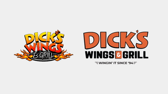
Comparing the final logo side by side:
In the previous Dick’s Wings & Grill logo, several dated features and styles, including the chicken wing apostrophe, flames, and gradients, were included. The most challenging aspect of the logo redesign was toning down the comic-style elements for several reasons. The new brand identity for DWG not only modernizes the logo but also distinguishes it from other brands with a significantly different design style. This serves as a valuable lesson in safeguarding your brand equity and reputation management.


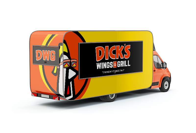
We created multiple versions of the Dick’s Wings & Grill logo in both horizontal and vertical layouts to ensure brand continuity when used for signage.
Brand continuity is essential, particularly for franchise businesses, as it fosters trust with customers by demonstrating that you can maintain consistency not only in your brand identity but also in crucial areas like your menu and service.
The final version of the DWG brand refresh features a solid color palette with a slightly modified “Dick’s” typeface for a cleaner and crisper appearance. The overall logo is symmetrically balanced, presenting itself less like a comic character.
HOMAGE TO THE LEGACY
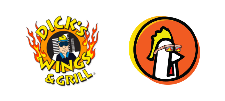
One element that received significant love and support from the initial draft is the character “Richard the Roo.” This logo iconography pays homage to the original Dick and the initial logo, which featured Dick as the centerpiece.
Roo sports the same shades as the original Dick, and he has slicked back his mullet comb instead of a yellow hat. Roo can be seen either casually sporting his standard shades or sporting fiery frames to add a bit of spice.
Plans are still underway to officially integrate Roo into the DWG brand, with numerous creative ideas from Dick’s Wings & Grill marketing team simmering.


As Dick’s Wings & Grill continues its expansion, their commitment to excellence grows alongside. It’s not just a local favorite for wings; it’s a destination for families, offering not just delicious cuisine but an experience. They transformed each restaurant’s interior, creating a vibrant and inviting atmosphere that matches the high standards they set for themselves.
Our approach was strategic and bold, akin to innovative automotive prototypes. Preserving the logo’s integrity was paramount. The redesigned logo strikes a perfect balance, modernizing the brand while preserving its essence. The final version is a testament to our dedication to excellence, ensuring uniformity in signage and brand representation.
By removing outdated elements and embracing a modern, unique design, we safeguarded the brand’s equity and managed its reputation effectively. The incorporation of “Richard the Roo” pays homage to the brand’s roots, adding a touch of creativity and uniqueness.
When devising your brand strategy, forward-thinking is non-negotiable. Align your brand identity with your business objectives, ensuring a seamless connection. For Dick’s Wings & Grill, “DWG” will become the official shorthand, ensuring clear and consistent brand communication. This concise approach ensures that the brand’s message resonates powerfully, leaving a lasting impact on its audience.

The Evolution of Brand
When devising your brand strategy, it’s crucial to think ahead and align your brand identity with your business objectives. Future plans include using “DWG” as the official shorthand when referring to Dick’s Wings & Grill, ensuring it’s not merely referred to as “Dick’s.”

